At Pixelpillow, we want the user to have a great user experience. That starts with preventing frustration (we also call it 'frictionless'). But that is just the beginning: the next step is to ensure that the user 'likes' it, is surprised, amazed or even inspired, In other words: enjoys using it. And in addition, we also want it to be distinctive and proprietary, so that it reinforces the brand experience.
There is an area of tension between these goals - removing friction and being distinctive or surprising. Because you reduce friction mainly by using conventions. The user knows these, so it takes little (mental) effort to perform a task.
But if you want to be surprising and distinctive, you quickly arrive at unconventional solutions. Which promptly reduce usability.
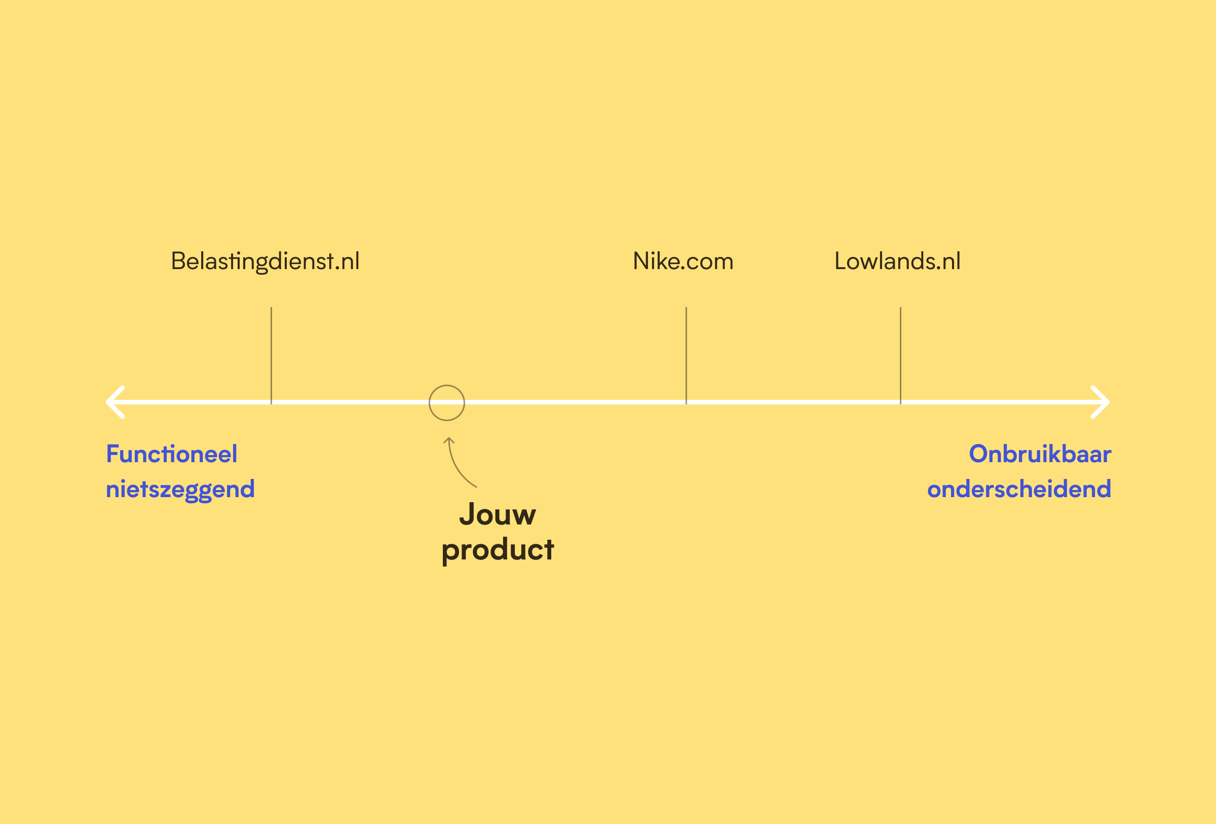
It seems like a catch-22: conventional sites quickly become generic, lacking in distinction and boring. 'Functionally nondescript', in other words. And original, unique sites are usually not user-friendly, in other words: 'unusable distinctive'.


In a related field - that of architecture - one encounters a similar discussion. On the one hand, the visionary modernists who want change and individuality but often ignore the user in doing so, and on the other, the architects who put the users interests first and therefore wants to build on familiar patterns. In recent years, the latter group in particular has started to speak out increasingly clearly in favour of a more 'user-centred' approach:
.. on the one hand, there is the architectural avant-garde, led by His Remness Rem Koolhaas, and on the other, the suckers who design residential areas in retro style. These have become completely separate circuits. The architects in both camps, so to speak, hardly feel they belong to the same profession any more.
Hans van der Heijden - architect, publicist and former visiting professor at the University of Cambridge
Those buildings are generally abstract in design, and that abstract form is the code of that group of architects, with which they have lost all touch and contact with people. These architects are also not at all interested in what people think.
Sjoerd Soeters, urban architect
The above quotes paint a picture of two incompatible visions. But is this true?
The right balance
At Pixelpillow, we think design is a service profession, aimed at making the user's tasks as easy as possible. But we also think it's important to innovate, surprise and be our own. So we think it's important to ask ourselves with every project: How do we strike the right balance between functionally nondescript and unusable distinctive? How do we make something special without sacrificing usability? Let's look at the tools we have for that:
How do we find the right balance between functionally nondescript and unusable distinctive?
01.Individuality through a distinctive design
We can try to look for uniqueness in elements that do not affect function. For example, in photography, use of colour and graphics. You then separate that which matters for frictionless operation from that which provides individuality.

02.Individuality through distinctive language
A unique tone of voice in microcopy and longer texts can create a special user experience.
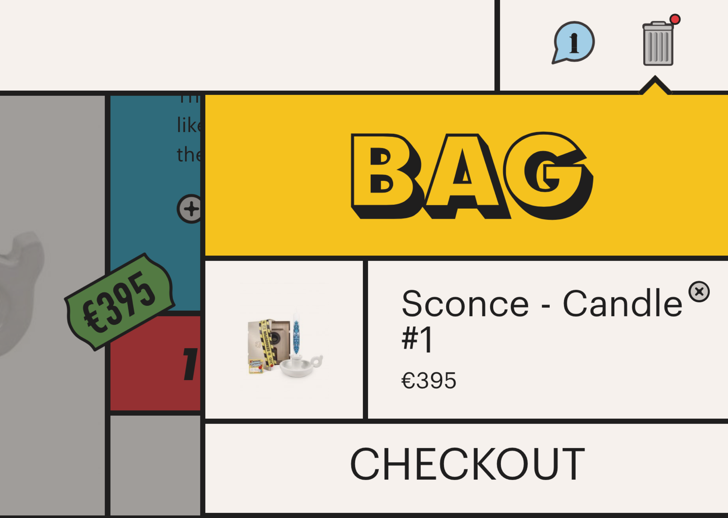
This solution is slightly riskier, because copy and usability touch more. If instead of 'portfolio, about us, contact' you rename the menu items to 'what, who, where', it might be more original, but you are asking more of the user. This can be solved by pairing a more poetic use of language with practical and clear language. As Ueno.co does below.


03.Uniqueness by compromising on usability
This is obviously swearing in church, but is usability equally important with every type of site or application? For a site for a hip clothing brand with a young target audience, experience and uniqueness might be more relevant than a super-clear navigation structure.
What if we made it depend on the goal and target audience? For example, by trying to position the product on the next line in the orientation phase, with the client and the team. Then, depending on this choice, you can then focus a bit more on distinctiveness one time, and usability the next.

04.Testing for both usability and experience
We are used to testing our designs for usability (does the user understand how it works?). But it is just as important to also validate whether the experience matches the brand, and whether the product is distinctive and therefore 'memorable'. One way to test this is a 'Desirability test', where you focus the questions more on the 'feeling' a user has with your product.
Circlink Back to architecture ...
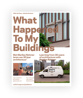
Of course it's always a good idea to check again after realisation whether what has been thought up is being used as intended. And make adjustments where necessary. Like architect Marlies Rohmer did, when she went back to the buildings she designed after a 25-year career. In the book 'what happened to my', she describes the sobering experience of seeing how users have adapted her buildings to everyday use.

